PROJECT 1 - UX Writing
Language Simplification &
Iconography Integration in Etality - A SaaS Tool
Language Simplification &
Iconography Integration in Etality - A SaaS Tool

Project description
Project description
Project description
This UX writing project was for Etality, a SaaS product focused on process automation and management.
The initial challenge included simplifying the language throughout the tool’s navigation system. When I joined, the terminology used was highly technical and code-based, creating a barrier for users.
Process
Process
Process
This category details the step-by-step approach taken during the project, including research, planning, design, development, testing, and optimization phases.
Research & Planning
Conducted market research to identify existing scheduling challenges and user preferences. Defined target audience segments and organised user interviews and usability testings to identify existing issues and uncover additional pain points that were not addressed in the current version of the tool
Design & Prototyping
Collaborated with designers to create intuitive user interfaces and interactive prototypes. Iteratively refined designs based on user feedback to enhance usability and visual appeal.
Implementation
Leveraged agile development methodologies to build the scheduling app from the ground up. Prioritized feature development based on user feedback and technical feasibility. Implemented AI algorithms to analyze user behavior and optimize scheduling recommendations.
Testing & Optimization
Conducted rigorous testing across various devices and platforms to ensure compatibility and performance. Gathered user feedback through beta testing and iteratively optimized the app based on usability metrics and user satisfaction.
User Interviews &
Usability TestingGoal: To identify existing issues and uncover additional pain points that were not addressed in the current version of the tool.
This approach helped us observe their real-world tasks and understand which steps of their process the tool was unable to accommodate.
Market research &
Competitors' analysisAnalysed tools like Zapier, Microsoft Power Automate, Automate.io, and Appian to understand why users preferred certain tools over others.
Findings:
Similar Navigation & Technical language :
The language used was often highly technical, making it particularly a steep learning curve.Limitations of Onboarding Systems : Not very intuitive & only covered basic features.
Accessibility Barriers : Not easily accessible, requiring a demo call just to get familiar with them.
User Interviews &
Usability TestingGoal: To identify existing issues and uncover additional pain points that were not addressed in the current version of the tool.
This approach helped us observe their real-world tasks and understand which steps of their process the tool was unable to accommodate.Market research &
Competitors' analysisAnalysed tools like Zapier, Microsoft Power Automate, Automate.io, and Appian to understand why users preferred certain tools over others.
Findings:
Similar Navigation & Technical language :
The language used was often highly technical, making it particularly a steep learning curve.Limitations of Onboarding Systems : Not very intuitive & only covered basic features.
Accessibility Barriers : Not easily accessible, requiring a demo call just to get familiar with them.
User Interviews & Usability Testing
Goal: To identify existing issues and uncover additional pain points that were not addressed in the current version of the tool
I conducted user interviews to understand User's needs and usability testing sessions with multiple users to analyse how they navigated the tool.
This approach helped us observe their real-world tasks and understand which steps of their process the tool was unable to accommodate.Market research & Competitors' analysis
Analysed tools like Zapier, Microsoft Power Automate, Automate.io, and Appian to understand why users preferred certain tools over others and to explore the common language used in these platforms.
Findings:
Similar Navigation and Technical language :
While we found many similarities in their navigation systems, the language used was often highly technical, making it difficult for users to learn. For instance, Power Automate had a particularly steep learning curve.Limitations of Onboarding Systems : Some of these tools offered onboarding systems, but they were not very intuitive and only covered basic features.
Accessibility Barriers : Additionally, many tools weren’t easily accessible, requiring a demo call just to get familiar with them.
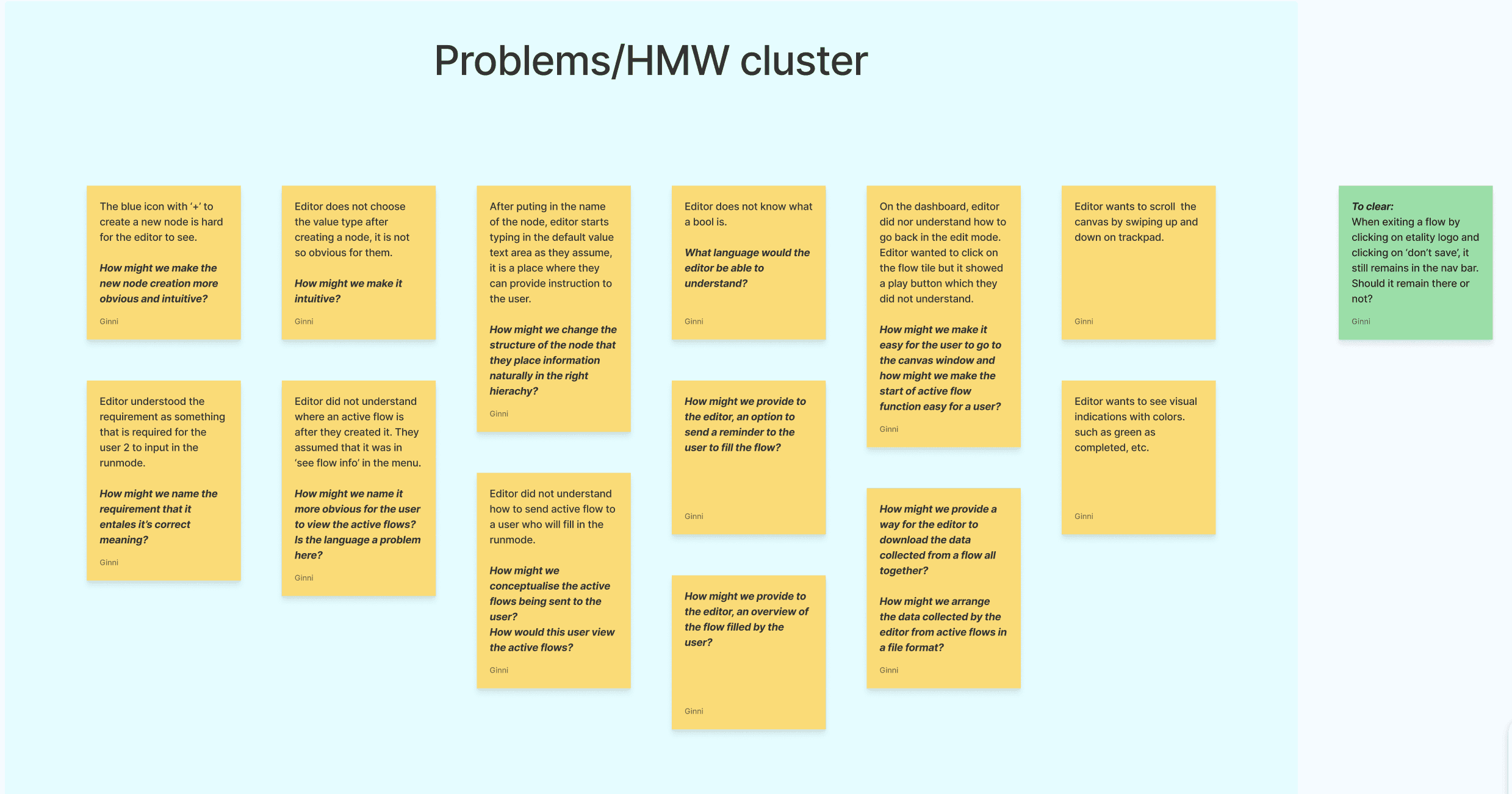
Confusing & Misleading Terminology Leading to Navigation Issues
Many users struggled to navigate the tool due to unclear and confusing feature titles. Several terms were unfamiliar, and in some cases, the wording led to actions that were different from what users expected, making the experience misleading.
For example:
Boolean and Value Type,
Trigger was labeled as ‘Requirement’
Requirement was labeled as ‘Validation’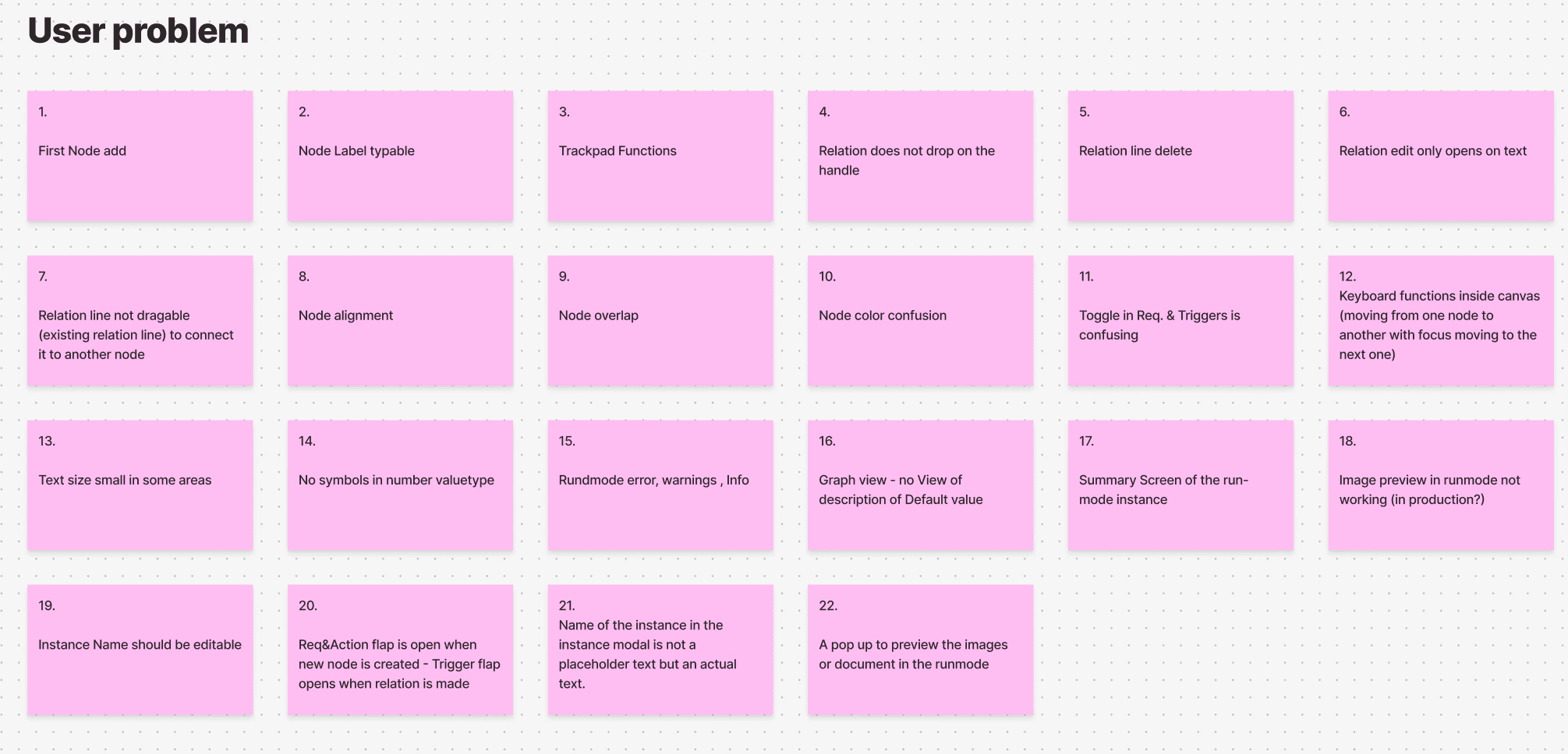
Disorganised Navigation & Lack of Clear Hierarchy
There was no clear hierarchy of information or actions, making navigation feel disorganised.
Elements were scattered across the interface, leaving users unsure of where to go nextNavigation Complexity, Leaving Users Uncertain on Workflow Creation
Because of placement of many icons and buttons, users' had hard time creating a flow as they could not find the button to create workflow.
Confusing & Misleading Terminology Leading to Navigation Issues
Many users struggled to navigate the tool due to unclear and confusing feature titles. Several terms were unfamiliar, and in some cases, the wording led to actions that were different from what users expected, making the experience misleading.
For example:
Boolean and Value Type,
Trigger was labeled as ‘Requirement’
Requirement was labeled as ‘Validation’Disorganised Navigation & Lack of Clear Hierarchy
There was no clear hierarchy of information or actions, making navigation feel disorganised.
Elements were scattered across the interface, leaving users unsure of where to go nextNavigation Complexity, Leaving Users Uncertain on Workflow Creation
Because of placement of many icons and buttons, users' had hard time creating a flow as they could not find the button to create workflow.
User Problems Findings
User Problems Findings
User Problems Findings
Confusing & Misleading Terminology Leading to Navigation Issues
Many users struggled to navigate the tool due to unclear and confusing feature titles. Several terms were unfamiliar, and in some cases, the wording led to actions that were different from what users expected, making the experience misleading.
For example:
Boolean and Value Type,
Trigger was labeled as ‘Requirement’
Requirement was labeled as ‘Validation’Disorganised Navigation & Lack of Clear Hierarchy
There was no clear hierarchy of information or actions, making navigation feel disorganised.
Elements were scattered across the interface, leaving users unsure of where to go nextNavigation Complexity, Leaving Users Uncertain on Workflow Creation
Because of placement of many icons and buttons, users' had hard time creating a flow as they could not find the button to create workflow.
Solution
The resulting platform app offers a seamless user experience, allowing individuals and teams to effortlessly manage their processes.
Language Simplication
Transformed the technical jargon into everyday understanding language.
After conducting multiple usability sessions and analysing the data collected, language was changed to ensure users understand the meaning of actions and buttons.
The language change was followed by more testing sessions to ensure comprehension.
These sessions were a success.
Iconography Integration
Seamless integration with popular icons with the text, which bought clarity for users what the word entails.
Include icons with the text, so it becomes more clear for users what the word entails, with an added benefit of users learning the tool's language with the help of icons.
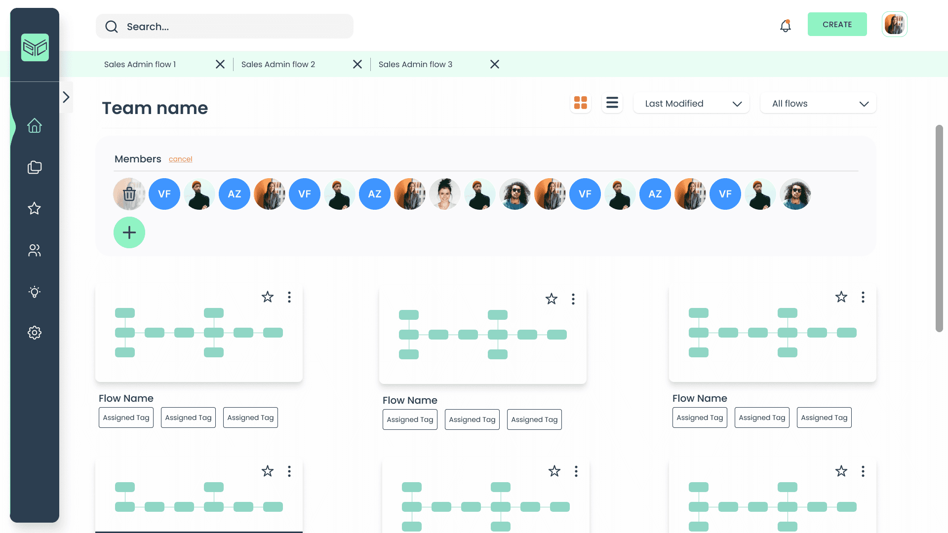
Navigation System Overhaul- Redesign the Dashboard and Process Creation System
Redesign of the tool's navigation architecture to enhance user experience.
Selected Case studies
Selected Work
Selected Case studies